ShopDreamUp AI ArtDreamUp

Deviation Actions


Suggested Deviants


Suggested Collections


You Might Like…


Description
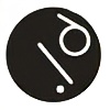
aufstand
Image size
392x535px 32.37 KB
Comments2
Join the community to add your comment. Already a deviant? Log In
This is an interesting piece you have here (I had to look up the translation before I understood the concept though).
I like the feel of it, the emotion of the piece, and I think the movement you've created with your primary graphic is very good. It's rhythmic, with a bit of chaos but controlled in a definite direction. It's an image of intention and determination, and for your theme that is very good to have. I worry that you might have too much (or too little) happening in the graphic though. The amount of detail and texturing is in the ambiguous stage right now. It's definitely simple, but not simple enough to be graphic and not detailed enough to be representational. I'd say pull it in one direction or the other. Either simplify it to the point of minimalism (two or three strokes, little to no texturing) (this is my preference but I am of the "good design is as little design as possible" school of thought) or bring depth into it by pushing out of the black and white. If I were to take this concept further I'd rework it into both a logo and a poster design - trying to find something that portrays the same image and emotion with two different aesthetics.
The text is difficult. The first thing I notice is that reading upwards feels unnatural and disorganized. I know you intended to get the Aufstand message across by literally writing upwards but it doesn't really communicate that very well. Another difficulty is that it is only visually supported on the outside, the text is falling away from the graphic and off of the page. Additionally the weighting of the letters seems pretty arbitrary, they are emphasized are diminished for no real reason. I'd say you could take them in two directions. Either unify them more with the central graphic (right now they only share line style), by physically anchoring them into the lines and twisting them to match the flow - or, take them in a different direction and use your font treatments and styling, not direction or placement, to indicate the meaning of the text. The four R's you have are also visually separate from everything else, they don't relate to their surroundings.
You asked specifically about the use of white in your pieces, so here are my thoughts. For this one, with no color, you are designing a shape, not an image - so the coloring of your piece is not as important as its structural appearance. It does however weaken your figure ground relationship. Everything in black is off the layer of white, nothing blends or combines, so your elements appear a little disjointed against your background. Separating things like that (especially when you don't bleed anything off the edge of the page and keep it all relatively centered) will always make for an awkward composition.
It feels like you have a lot of distinct elements that just aren't blending very well together. You need to strengthen their relationships and the relationships to your canvas (everything is orphaned right now, nothing overlaps). It's a good image with a powerful graphic, it could just communicate its message better.
This comment was given through #ProjectComment - Guaranteed & Constructive